
-
Client
Jardin de Toury
Regenerative Farm -
Roles
Brand Designer
Copywriter
Art Director
Web Designer -
Deliverables
Branding & Naming Workshops
Photoshoot Production
Website & Instagram
Collaterals & Packaging -
Timeline
2 months

Overview
Jardin de Toury is a regenerative farm in Burgundy, France. Originally producing heirloom fruits and vegetables for Michelin star restaurants, the farm had steadily expanded its range and initially approached me with the intent of rebranding and building a website to showcase and sell its produce.
After conducting an audit of the existing brand system and reviewing business goals with the owner, we decided to explore the possibility of expanding to B2C. I was tasked with creating the complete B2C experience, from the e-commerce website all the way to the packaging and customer support systems.
Brand Audit
The previous branding had not been updated since the farm was founded, back in 2010. I went through every existing asset and touchpoint, from the limited online presence to packaging and store display, analyzing the strengths and weaknesses of the visual brand. Some elements felt a little outdated, such as the font choice, and some were clear pain points, like legibility issues with the packaging.
Because of the business goals of the stakeholders, it was quite clear to me that I wanted this rebranding to evolve the existing brand, rather than propose a completely different concept. And so I made sure to also define the successful elements of the past branding and iterate on these. For instance, the mascot of the logo was based on the old wind vane on the roof of the farm - and had been placed there by the great-grandfather of the founder - a historical and memorable personification of the brand.
I surveyed the competitive landscape, analyzing the marketing strategies of more than 20 local farms and produce delivery companies, which pointed to other strengths. Many of these businesses used green accent colours; Toury’s red was a great differentiator, it just needed a little tweaking.

User Research
The farm was already well established with many high-profile restaurants in the Paris food scene, and the existing customers were on average over 50 years old. I wanted to speak directly to these existing customers, to understand how they saw the brand, and uncover eventual pain points in their shopping experience.
The expansion to B2B also meant the brand needed to speak to slightly younger customers*, more likely to order produce online. I also set up some interviews with prospective customers, some who knew of the farm and some who already regularly shopped for sustainable produce online.
This extensive research phase helped me define clear brand goals and attributes. The previous iteration had emphasized the “luxury” aspect of the heirloom vegetables, by using a very thin serif font and the brand name “Domaine de Toury”, evoking French nobility and tradition. But many customers associated the name and brand with a higher price point, which was not the case. I decided to tackle this disconnect between the image and the price point by repositioning the values and tone-of-voice of the brand.
*https://www.insee.fr/fr/statistiques/2498792 https://www.researchgate.net/figure/Age-of-organic-food-consumers_fig3_321988783

Branding Concept
After several workshops and some deliberation, we decided to change the business’ name from “Domaine de Toury” to “Jardin de Toury”. One of the rationals was to separate the farm’s production from its hospitality activity. But the main goal was to shift the brand’s perception from a luxury positioning to a more approachable family business. Despite Toury’s commitment to exceptional practices and quality, the price point of the produce was actually mid-range and my research had shown the name and branding deterred some customers.
Because of its cutting-edge regenerative practices, there was a treasure trove of content to share with engaged customers curious to know more about where their food comes from. We decided to make use of the owner’s experience, and share more about his experimentations in farming techniques. This became the core of our content strategy and tone-of-voice: friendly family business, but engaged and precise.


Service Design
Much time was spent defining the ideal experience for each type of customer, and harmonizing it with logistic constraints (transporting schedules, vegetable freshness, buying patterns of restaurants and private consumers…) I sketched several schedule options for harvest, transport, and delivery times, and tested them with target customers. We set up test orders with some of our interview participants and I collected their feedback through a short survey to refine our offer.
I defined the marketing needs of the business too, and the various assets that would need to be produced, from social media to flyers and packaging.

Visual Design
For the typography, I wanted a font that would convey the brand’s anchorage in tradition and excellency but its pioneering and experimental spirit too. I chose Ortica - designed by Benedetta Bovani and published through Collletttivo - which comes in two weights. The bold has a faceted serif, whose rugged segments evoke spaded soil or handworked metal and the thinner weight has a more ‘old world’ with distinctly plucky terminals.
Following the audit’s discovery, I used the bold weight for the logotype. We kept the little gardener mascot, so ingrained in the brand’s history, but reworked it for more harmonious proportions and applied a faceted treatment to match the logotype.

Deliverables
I built the e-commerce website using Shopify and worked with a developer to add some customised code elements. For the packaging, I created a custom stamp for the delivery boxes, a new label for the crates, as well as stickers and flyers.
I scouted photographers and produced a 3 day shoot on location. The content would be enough to animate the instagram during the whole season. We also set up a simple product photography studio in a corner of the gardener’s shed, for the weekly harvest.


Custom stamp design for the delivery boxes.

Redesign of the crate labels.
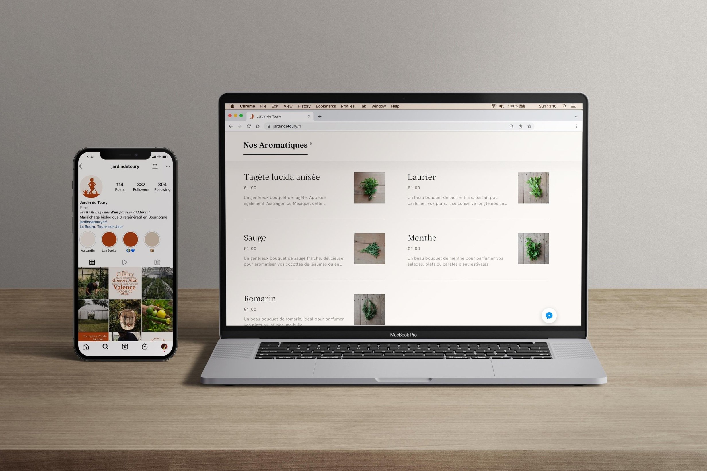
Building a responsive e-commerce website and cohesive social media presence.
Outcome
The launch was successful, and received positive feedback from new and existing customers.
However, after a few months, it became apparent that the delivery costs were too high for B2C consumers, who ordered smaller quantities. These could only be reduced through consequent scaling up, a growth not aligned with the regenerative practices on the farm.
Ultimately, the stakeholders decided to stop advertising their B2C offer, and focus on outreach for B2B for which the new branding and website provided ample material.
