-
Client
Korē
B2B Sustainable Grocer -
Roles
Art Director
Graphic Designer
Web Designer
Copywriter -
Deliverables
Branding & Naming Workshops
Brand Book
Website & Instagram
Collaterals & Packaging -
Timeline
1 month

Overview
Korē was founded by 3 entrepreneurs with extensive experience in the B2B food industry. This new venture was intended as a bespoke service catering to the new generation of French chefs, connecting them to a wide network of sustainable and high-quality fruit and vegetable producers.
These stakeholders’ expertise was undeniable, but they needed a story that conveyed it and spoke to their audience. I guided them through the branding process, helping them align their expectations and visions for the brand, and progressively craft its story and values into a compelling visual narrative.
Branding Concept

A quick survey of the direct competitors and interviews with target customers clearly pointed to an opportunity for marketing this service differently. The business would operate within the Rungis Food Market, a rather traditional marketing environment, which has in the past 10 years failed to attract a younger generation of chefs keen to develop direct relationships with small and sustainable producers.
Our goal was to appeal to them without alienating more conservative customers, balancing between tradition and freshness.
I conducted several workshops with the stakeholders to help them define the key offerings of the service and how to communicate them in a way that would resonate with that target demographic.
The name of the company had not been defined yet and I saw this as a great opportunity to stand out with an incisive and catchy name. We looked to Greek mythology, in order to anchor the brand to a sense of history and close relationship to nature, and landed on the figure of Korē (also called Persephone) the goddess of Spring.


Visual Design
In order to seduce our target demographic, I looked to their direct environment: I created mood boards inspired by the latest hospitality interior trends. I wanted to emulate the elegant simplicity of the up-and-coming restaurants working with local and sustainable ingredients, balancing textures with earthy tones.

Because this was a completely new venture whose business goals would still fluctuate for the coming years, I created a flexible visual identity, composed of various “bricks” that could be combined according to evolving needs. In addition to the expected brand colors, and typographic system, I opted for a modular logo system, with horizontal, vertical, and circular configurations that could anticipate future packaging needs and marketing formats.

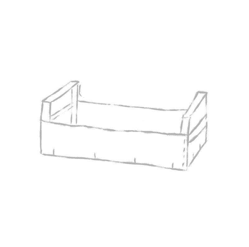
I also encouraged the stakeholders to keep upfront costs low by opting for evocative illustrations instead of the more common (and expensive) food photography. The illustrations convey the bespoke quality of the service, and the textured brushstrokes speak to the manual work that goes into producing sustainable fruit and vegetables.
The main iconography was inspired by the pomegranate seeds Hades gave Korē to celebrate their union. For the backgrounds, I created a series of abstract brushstrokes, evoking horizon lines, to add discreet visual interest to larger areas. The texture of the brushstroke also brings a dynamic & modern impulse that counterbalances the more traditional identity elements.


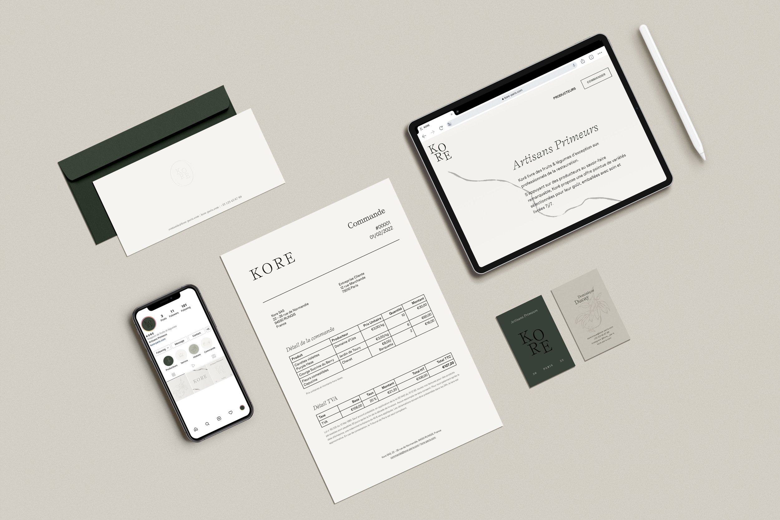
Deliverables
One of the main value proposition of the business was to provide a premium experience for the customers, ensuring a concierge-like 24/7 service. Korē guarantees that each order is packed by hand by their specialists and the packaging needed to reflect that exceptional care. We decided to go for entirely recyclable materials, printed with food-safe, water-soluble white ink.
I designed stationery for the partners, as well as a minimal invoice and embossed calling cards for the clients. I built an editorial website, copywriting all the content, as well as created a minimal Instagram profile as placeholder for future activation. The experience was thought down to the last details, with branded trucks and even embroidered uniforms for the delivery people.


Outcome
By synthesizing their business goals and framing their project through the evocative lense of Greek mythology, I managed to create a cohesive yet flexible visual identity for these stakeholders. I carefully designed and crafted high quality deliverables, ensuring the premium value proposition of the brand could be felt by the customer at every touch point.
Korē was launched in May 2022, and while it is still too early to measure the impact of my intervention, the branding has so far received positive echos from customers and competitors alike.
