Holos Case Study
Designing an all-in-one tool for people living with chronic conditions
-
Project
Responsive Web App Design
-
Roles
UX Researcher
UX Designer
UI Designer -
Timeline
6 Months
Overview
Holos is a responsive web app designed to assist chronically ill people in managing the practical, physical and emotional aspects of their condition. Everyone knows at least one chronically ill person, whether it is a parent with high blood pressure, a friend with diabetes, or a partner with auto-immune disease, unfortunately, chronic conditions are increasingly prevalent. I was curious to develop a tool directly helping these people and worked on this project independently, applying design-thinking principles.
THE PROBLEM
Our user needs a way to manage their chronic condition holistically because they want to spend less time thinking about their disease, and more time enjoying life. We will know this to be true when our user feels empowered to manage their condition, educate themselves about it, and improve their health through new habits. THE SOLUTION

A responsive app which allows users to store their medical data, set up medication reminders, book consultations with specialists, and log their symptoms and habits daily.
TARGET METRICS
Success will be measurable through the following metrics:
Number of habits set up
Number of documents uploaded
Number of active days per week & number of Holos chats per week
Number of booked specialist appointments
Time on Task, Task Sucess Rate, General Satisfaction Score
HYPOTHESIS
How might we support people living with chronic conditions in their day-to-day life?
Chronically ill people need to use many products & tools to manage their disease, synchronising all their data might simplify their lives and avoid some crucial information getting lost.
Chronic conditions are stress-inducing, managing the condition feels like a lot of work, and overwhelm might lead users to neglect certain aspects of their health. A dedicated tool might help our users feel more empowered to make better choices for their health.
Health apps offer general tracking that does not necessarily apply to chronic conditions, creating a dedicated tool might generate more health insights.
Current products do not allow for easy sharing of information with medical professionals, facilitating the sharing of updated medical records might lead to better communication and ultimately better care.
DESIGN-THINKING PROCESS
-
![]()
1. Understand
I surveyed the competitive landscape in order to identify potential gaps in the mHealth market. I set up interviews to understand chronically ill people’s pain points, goals & needs and used affinity mapping to generate insights.
-
![]()
2. Define
I synthetized my research into a problem statement, and crafted personas to visualize the specificities of people living with chronic conditions.
-
![]()
3. Ideate
Based on my research findings, I crafted user journeys and flows, ideating on potential ways to solve my users’ problems. I created a site map and refined it with card sorting.
-
![]()
4. Prototype
I sketched out low-fidelity interfaces for the main features of the product, and progressively refined them into mid-fidelity interactive prototypes using Figma, incorporating feedback from other designers.
-
![]()
5. Test
In order to validate my hypotheses, I put my prototype in front of my target users during moderated usability testing sessions. Classifying usability issues in a rainbow spreadsheet allowed me to prioritize the necessary iterations.
-
![]()
6. Refine
I incorporated the testing insights into a revised prototype and then went on to polish the interface, creating a branding concept and translating it into a visual design system. I refined the screens to ensure they met section 508 WCAG standards for accessibility.


1. Understand
LANDSCAPE
I wanted to get a better idea of the breadth of products available in mHealth. There are over 350,000 mHealth apps available in major app stores, a number that includes medical as well as health and fitness apps. I identified two main categories of products, the ones focusing on information & education, and the ones based on tracking and utilizing Internet of Things technology.
I was inspired by the chatbot features of products like Ada and Juli and decided to survey the diagnosis app Ada in more detail. Advancements in conversational AI are especially interesting to me and I wanted to explore using a chatbot feature as an effective data entry tool in order to explore whether a fluid conversation would be a more engaging and simpler way for users to track their symptoms and habits. I also wanted to study a more established product, and conducted a SWOT analysis of WebMD.
COMPETITIVE ANALYSIS: WEB MD
WebMD is one the leading online publisher of medical news and information, since 1998. It provides trustworthy and relevant information, as well as an active community and many affiliate websites and products.
COMPETITIVE ANALYSIS: ADA
Ada is a leading diagnosis app powered by a cutting-edge AI built by doctors and scientists. “Our medical AI simplifies healthcare journeys and helps people take care of themselves”. Founded in 2016, it has already gathered a 10 million-strong userbase.

BUSINESS OPPORTUNITY

Designing a product for people with chronic illnesses implies a wide target user base. I decided to focus on the more active segment of this population, users aged 18 to 50 years old, as they would be easier to acquire through digital marketing channels. This target audience has a higher incidence of users with visual, audio, or mobility impairments and my designs had to take their specific needs into consideration.
I saw this as an opportunity to create a product that would better people’s life by taking care of the mental load of living with a chronic condition, helping them manage their symptoms, and maybe even improve their health through habit building and information.
Business-wise, the opportunity lies in the apparent fragmentation of the mHealth market, with very few apps catering to both medical data/symptom tracking and health information/habit building. This tool could be used by a medical institution or practitioner for outpatient treatment. Or could also be offered as a stand-alone product with a subscription model.
-

More than 50% of Americans and Europeans have at least 1 chronic illness. Chronic diseases are interrelated, have common risk factors, and are largely preventable, yet 9 people out of 10 die of chronic disease.
-

The size of the mobile health app market was estimated at $12.4 billion in 2018 and is expected to reach $236 billion by 2026. Many apps focus on tracking health markers or sharing health information, but very few offer a holistic approach to disease management.
-

87 million people in the US used a health or fitness app monthly in 2020. That’s about 30% of adult smartphone owners, a number that’s expected to grow in the coming years.
USER SURVEY
In order to get a feel for this demographic and prepare the user interviews, I wanted to get a larger sample of chronically ill people to answer a few questions about their habits and feelings. However, finding participants for the survey proved quite a challenge, with most online support groups for chronically ill people having a “no survey” policy. Despite the limited amount of participants, the survey still provided a first look into my users’ paint points and habits and helped me write a script for the interviews.
-
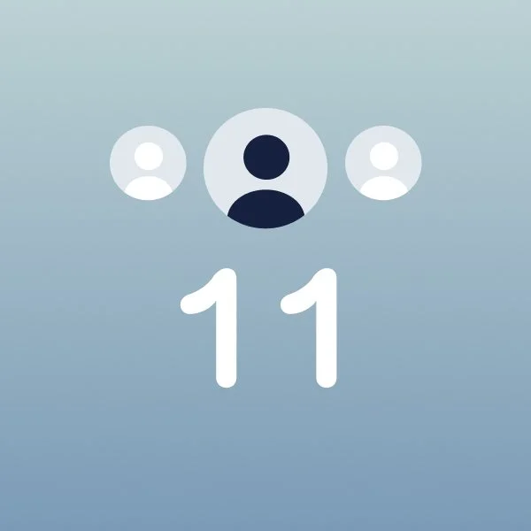
The survey gathered answers from 11 participants, aged 15 to 46 and suffering from chronic conditions such as diabetes, auto-immune disease, cancer, or heart problems.
-

45% reported feeling “defeated” as a dominant emotion when thinking about their chronic condition.
-

63% of participants used one or two mHealth apps on a weekly basis, and 90% liked the idea of an app to store and organize their medical records.
USER INTERVIEWS
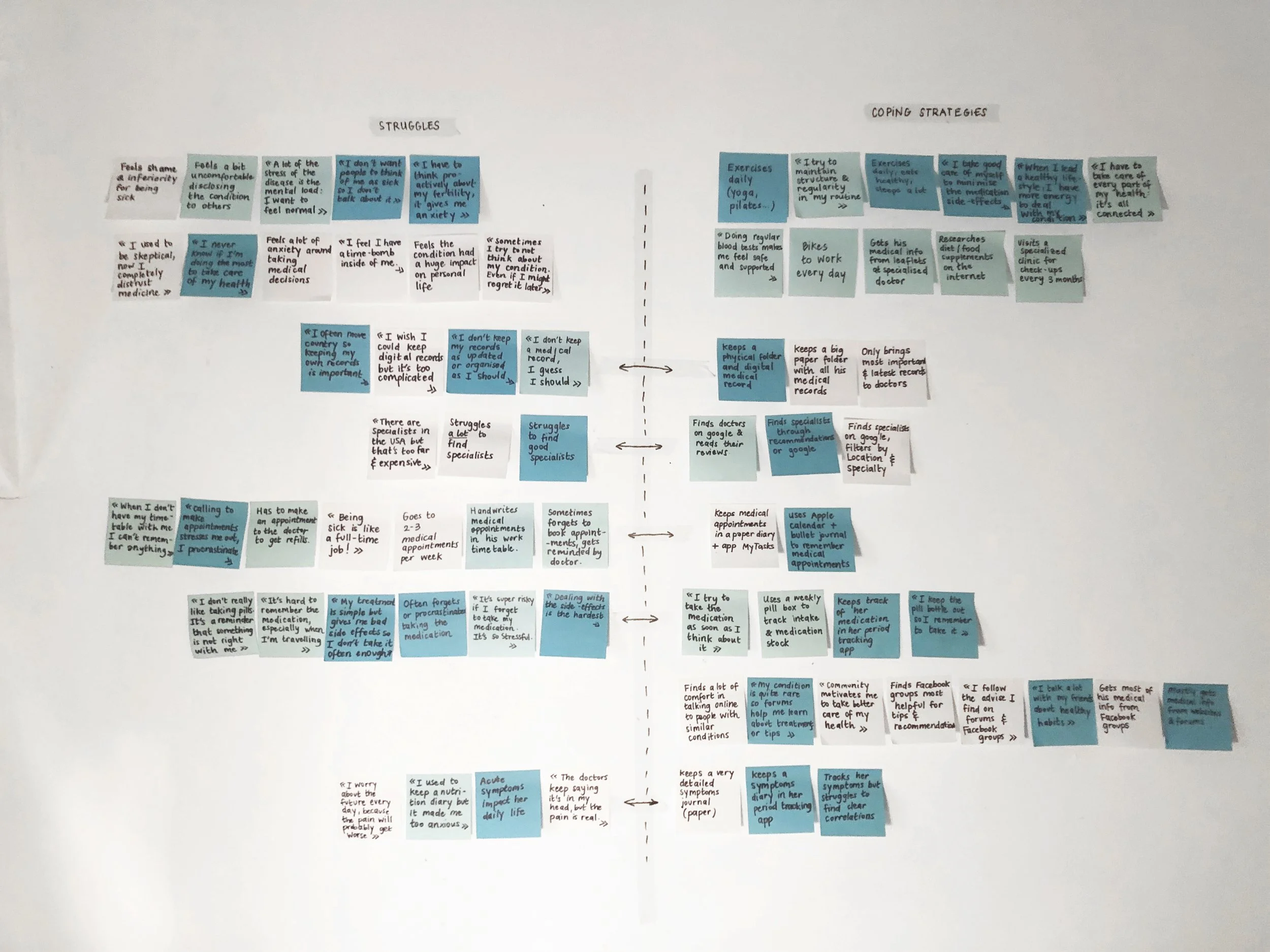
I wanted to hear firsthand about the problems faced by people living with chronic conditions, so as to gain unique insights into their coping strategies. The interviews proved quite emotional, as I held space for the participants to vent about the difficult physical, practical and emotional aspects of their condition. We shared beautiful moments of connection too, when they felt seen for sharing the difficulties linked to seemingly benign pain points, like struggling to keep their paperwork organized, or finding specialists near them… I then used affinity mapping to reflect on the interviews and generate cohesive insights about their behaviors and attitudes.
“Being sick is a full time job!”
“I never know if I’m doing the most to take care of my health.”

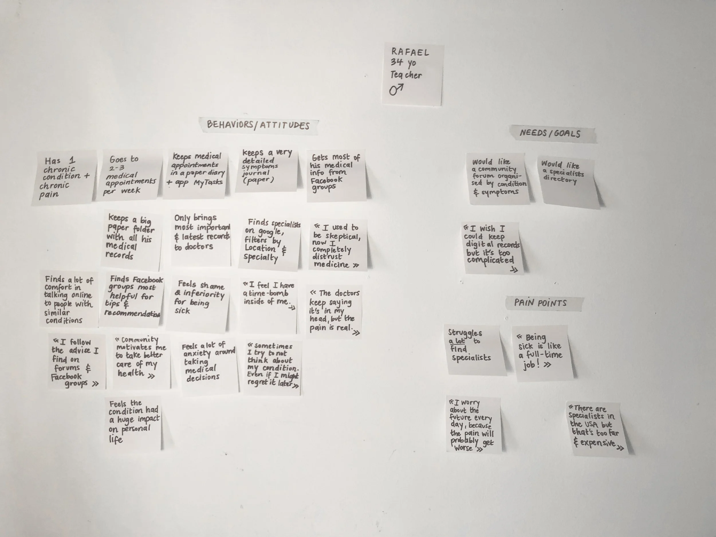
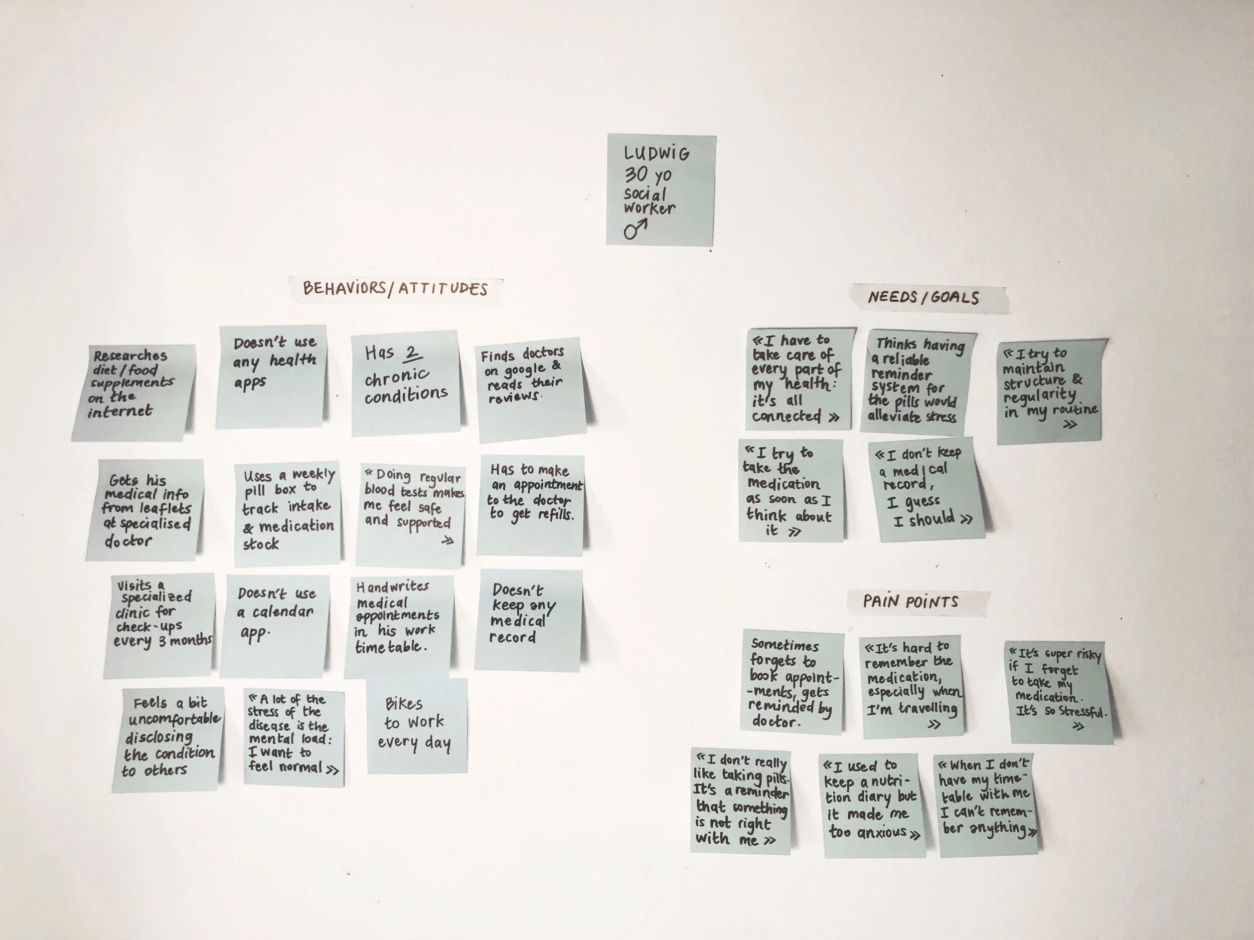

RESEARCH INSIGHTS
-
![]()
Impact
Living with a chronic condition impacts many areas of their life and can create very strong negative feelings in our users. Being aware of these intense emotions will allow us to design with more empathy, for situations where the user might be stressed, depressed, anxious...
-
![]()
Holistic
Health is a complex interrelated system and our users are extremely aware of this. They know the importance of taking care of every aspect of it, from sleep or exercise or diet, and react positively to suggestions.
-
![]()
Connect
Community is a very positive influence, by connecting with people with similar conditions, our users can share resources but also inspire each other to take better care of themselves.
-
![]()
Record
Keeping medical records is highly recommended by medical professionals but can be a complex task and cause stress or anxiety, users need an easy and efficient way to upload data and organize it.
-
![]()
Remind
Remembering to take medication can be a huge factor of stress in our users’ life, by creating a reliable medication reminder we have the opportunity to really ease their mental load.
-
![]()
Track
People living with chronic conditions experience a variety of symptoms and tracking them efficiently can help deal with them better or report them easily to their doctors.


2. Define
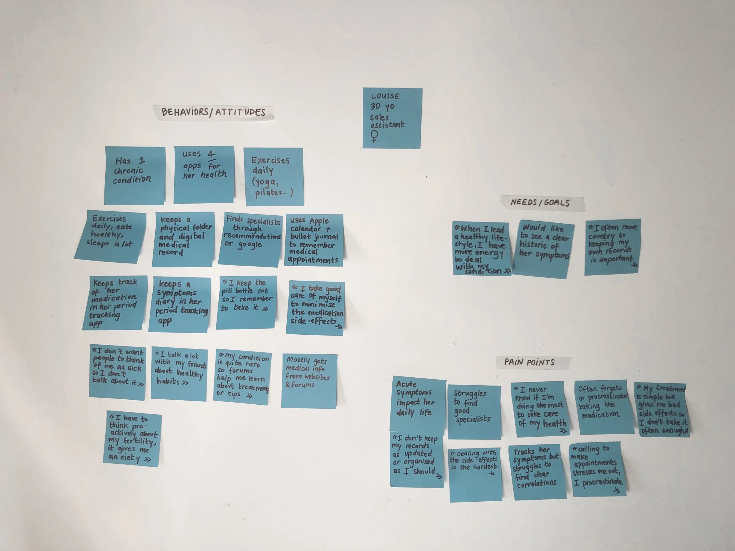
USER PERSONAS
At that point, I was able to define the problem and make some hypotheses. In order to synthesize the information gathered during the user interviews, and create a cohesive picture of the user, I created 2 personas, based on target demographics. Today, I would probably approach this differently and use archetypes instead. Gender and age are not the most defining factors when it comes to how and why people interact with technology, archetypes provide a more inclusive framework to empathize with users. These could be based on the idea of a person’s attitude towards their chronic condition for example pro-active vs passive, anxious vs empowered, or they could be based on the amount of input they are interested in giving and receiving from the product (hands-on vs hands-off).
3. Ideate
INFORMATION ARCHITECTURE
Because of my hypotheses, I was trying to solve my user’s problem through a holistic framework, at the core of which was the Holos chat, a daily chatbot conversation in which users could log their symptoms, habits and any relevant information in a fluid dialogue. For the MVP, I decided to prioritize mobile-first features and focus on the following moments:
Booking a consultation with a specialist
Setting up a medication reminder
Saving a document to the medical record
Checking in through a Holos chat
But even this reduced scope was proving challenging to structure. I ran a quick card sorting which helped me find appropriate names for each category and simplify the main navigation.
JOURNEY MAPS
I needed to start visualizing how each feature could insert itself in my personas’ daily life. So I crafted a few user journeys. This simple way to visualize at which point of the day and the potential emotional impact of a feature on a user was really helpful to start actually visualizing the design and flow.
STORYBOARD
Because logging symptoms and habits through a chatbot feature is still a relatively new paradigm, I decided to storyboard that feature, in order to best explain it to potential stakeholders. I knew I would need the help of AI engineers and developers to fully flesh out this idea and that a storyboard would be a great asset in order to align our expectations.

USER FLOWS
Armed with this clear picture of my users’ goals & expectations for each feature, I started sketching the best flow of interactions for them to reach their goals. Detailed user flows would be of great help when wireframing.
4. Prototype
WIREFRAMING
It was time to transform these concepts and schematics into actual interfaces. I sketched the features for mobile-first and then moved on to larger screen sizes, incorporating device-relevant features.

As I started sketching and building lower fidelity wireframes, one of my assumptions was that cards should have data previews on them. I thought navigation would be more explicit if users could already see a preview of what to expect behind each card. Retrospectively I think some participants in the early rounds of testing might have alluded to it, but it took me a while to realise that these preview states were actually very confusing for users, as well as slowing down the task flow by adding unnecessary taps. After sticking with the idea all the way to high-fidelity, I ended up replacing them with illustrations and little blurbs. Turns out cool-looking graphs are not always helpful 😅


One of the screens that posed the biggest challenge was the Specialist Profile. I wanted this screen to have a clear booking CTA while inspiring trust. In retrospect, I think I was trying to cram too much onto a single screen. Breaking the left alignment and centering the picture helped create a more polished layout. The map was unnecessary and easily replaced by an address link. I also experimented with the position of the booking button, before reverting to a more coherent bottom placement. Ultimately I decided to organize some of the less critical information in tabs.


DESKTOP OR NOT?
One of my assumptions when starting, was that older users would want a desktop version as well, since they tend to favour larger screens. The survey had also pointed out that 30% of participants used their phones and desktops to manage their medical records. But the interviews and journey maps added more nuance to that assumption, and as the features shaped up, they made increasingly less sense on desktop, and I decided to focus my efforts and keep the MVP mobile only.
Still, as I was sketching and iterating on my wireframes, I followed a mobile-first approach and progressively scaled up some of my designs to make sure they worked for larger screens too. I kept some features such as the medication reminder or the camera scanning for medical records mobile only. On desktop I opted for a side navigation, to make use of the wider screen real-estate. When scaling up, I realized I should really have applied an 8pt grid to my designs early on, which would have made scaling much more consistent. Since then, I have dived a bit deeper into grids and would definitely approach sizing my components and typography more systematically.


ONBOARDING
Since one of the distinctive features of the product was the chatbot, I thought there was an opportunity to make the onboarding experience more engaging by including a snippet of conversation before registration.
I experimented with the order of the onboarding elements: splash screen, sign-up screen & chatbot conversation. Because some interview participants had complained about onboarding slides being tedious, I ran a quick A/B test to see if a condensed screen explaining the main features of the app might solve that issue. Following the clear results, I kept the longer form onboarding and got to work on some custom illustrations.


5. Test
USABILITY TESTING
With the first prototype in place, I wanted to get it in front of a group of target users in order to weed out the biggest usability issues before moving forward. I conducted moderated usability tests with 6 participants and they proved really successful in flagging critical usability issues. I organized the testing results in a rainbow spreadsheet and rated the errors in order to prioritize the changes that needed to be made.

TESTING DIFFICULTIES

I really wanted to test my prototype with a visually impaired person as I knew that a consequent 13% of the global population has visual impairments, that this percentage augments with age and can be compounded by many chronic conditions. I was able to set up a test with a technologically savvy 60 years old entrepreneur who had recently become severely impaired. We had planned for the remote session to be facilitated by his regular at-home nurse, however, on the day of the test, the nurse was absent.
We decided to try and go ahead anyway, as my participant was convinced they could still complete the test. But despite my detailed guidance, we could not even manage to log him into Zoom (the login link was small and located too close to the screen’s edge).
This was a frustrating and painful experience, as I struggled to assist him remotely and he was once again confronted with his disability. But it engaged a thoughtful conversation about the myriads of unforeseen difficulties faced by impaired people and chronically ill people on a daily basis. In the end, this failed test turned into an insightful informal user interview.
6. Refine
BRANDING
Now that the most critical usability issues were fixed, I set out to create a coherent language system for the app. I wanted Holos to feel like a trustworthy, inclusive and relaxing environment for the users and needed the colours and interface elements to convey these brand values. Based on user interviews, I listed some brand adjectives defining the main attributes of brand and created a quick visualization highlighting these.

LANGUAGE SYSTEM
I documented the visual design in a detailed language system, highlighting the specifics of my design choices and creating an easy-to-access components library. Despite knowing this project would most likely not be developed, I still prepared all the files for handoff. I used to work in interior design, and understand the importance of clear file organizations and communication during handoff. The relationship between interior designers and architects has actually many similarities with the one between UX designers and developers!


ILLUSTRATIONS
In order to give the product a more personable feel, I created original illustrations for the onboarding slides. I decided to add a paper-texture in order to give them a tactile quality. I designed my prototypes with pre-loaded user content, but additional illustrations could be used to humanise empty-state screens too.
ACCESSIBLE DESIGN
As evidenced by my market and user research, people living with chronic conditions have a higher incidence of visual, audio, or mobility impairments and my designs had to take their specific needs into consideration. Some accessibility issues were detected early on during testing, I then conducted a detailed accessibility audit of the product and made further changes to adjust tap targets and visual contrast.
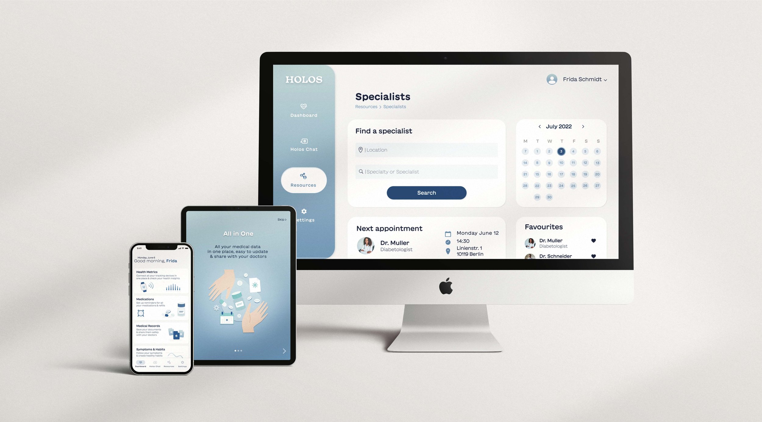
LATEST PROTOTYPE
MEASURING THE IMPACT
In order to measure the impact of the last rounds of iterations, I conducted another round of moderated usability testing with 4 participants. I was curious to see my initial KPIs had evolved: in my previous roles in interior design agencies, I had often felt disappointed at how subjective our approach could be. Today I really value being able to make data-driven design decisions. It was very satisfying to see the positive impact of my iterations.
-

Satisfaction
Overall satisfaction with the product (on a 7 point scale) went from 6,26 to 6.96, marking a 10% improvement.
-

Task Success Rate
Uploading a medical record was the task with the lowest success rate during initial testing. After iterations, TSR went from 66 to 100%, a 50% increase.
-

Time on Task
After changes, booking a specialist became x2.5 faster, as Time-on-Task went from 85 to 33 seconds. And uploading a medical record dropped from 89 to 22 seconds, 4x faster!
Summary
EVALUATION
I started this project with the goal to design a product for people living with chronic conditions. By building a product articulating features catering to many aspects of the condition and orienting the user through the humanized and holistic framework of a daily chatbot check-in, I have solved the initial problem:
Our user needs a way to manage their chronic condition holistically because they want to spend less time thinking about their disease, and more time enjoying life. We will know this to be true when our user feels empowered to manage their condition, educate themselves about it, and improve their health through new habits.
Each feature solves some of the sub-problems uncovered during the research phase, such as easy access to specialists consultations or getting reminded to take or buy medication. Meanwhile, the chatbot health questionnaire provides the user the peace of mind that relevant information and suggestions will be provided to them at the right time.
I had not expected that the chatbot feature would become so central to the product, but the more I researched the possibilities offered by advances in AI and chatbot design, the more I wanted to articulate all the other features around it. I would for instance be really curious to experiment with the chatbot as home screen.
KEY LEARNINGS
This project taught me a lot about empathy. Being faced with my users’ pain and frustrations was difficult at times, as I learned to be an empathetic ear while respecting a professional distance. It also fired me up to keep trying and improve my designs for them.
A big lesson was also in prioritizing and learning to scope down. I was somehow blindsided by my hypothesis of an all-in-one tool and kept trying to show everything at once, and all above the fold. Through testing, I learned the importance of contextual disclosure. Centralizing all the user data in one app doesn’t mean they need to access all of it at once and at all times. Ultimately it does not matter how many taps they need to do to reach their goal, as long as no thinking is involved.
Finally, I also identified a couple of gaps in my skill set, as I refined the project. Firstly, I had to admit that my understanding of grids was not sufficient, as I faced difficulties scaling my designs up. I will definitely approach sizing my components more consistently in the future. I also deepened my interest in chatbots specifically and more generally with ways to humanize technology, but I still have a lot to learn!
NEXT STEPS
I am now looking for a developer to make this project come to life. Some of the features I still need to design and test need a bit more research. Some of the questions I would like to answer are: how might we seamlessly integrate data from other devices? How might we encourage users to pair their wearables, sensors & IoT devices with our product? Or how could we iterate on the concept of community boards to make them relevant to the day-to-day evolution of our users’ health? And how might we create the conditions for empathetic and supportive connections between users, to allow them to share their experience safely together?
